2025 Design Colors: The Spirit and Aesthetics of a New Era
Colors are no longer just a background choice. They've become elements that influence user psychology, define brand stance, and transform the digital experience. In 2025, this approach is further solidified. Colors come alive by integrating with concepts like technology, nature, sustainability, and emotional intelligence.
The design philosophy of the digital age centers on palettes that are both visually appealing and capable of forging an emotional connection with the user. In other words, color is no longer just a "choice"; it's a "message."
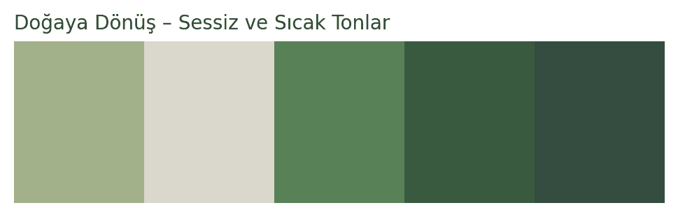
Return to Nature: Quiet and Warm Tones
One of 2025's strongest color trends features calming tones inspired by nature. Growing environmental awareness and the search for sustainability are clearly reflected in this year's color palettes. Quiet greens, earthy tones, and misty grays offer users a serene atmosphere.
These palettes create a simple, balanced, and soft look in both interior designs and digital interfaces. Wellness brands, yoga/meditation apps, and natural cosmetics companies especially favor this color family. These colors effectively create a breathing space; they're easy on the eyes, don't distract, and even provide a sense of relaxation.
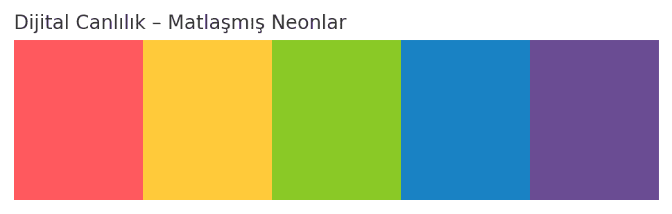
Digital Vibrancy: Muted Neons
Vibrant colors always grab attention, but in 2025, this attention comes from a different angle. The dazzling neons of the past are now appearing in a more sophisticated form. These colors are bright yet understated, energetic yet balanced, and have a wide range of uses, from tech product launches to music festival posters.
Muted neon tones are particularly favored by brands targeting younger audiences. These palettes reflect modernity and dynamism, while also creating an eye-catching and noticeable effect. They deliver highly effective results in social media content, mobile app interfaces, and video intros.
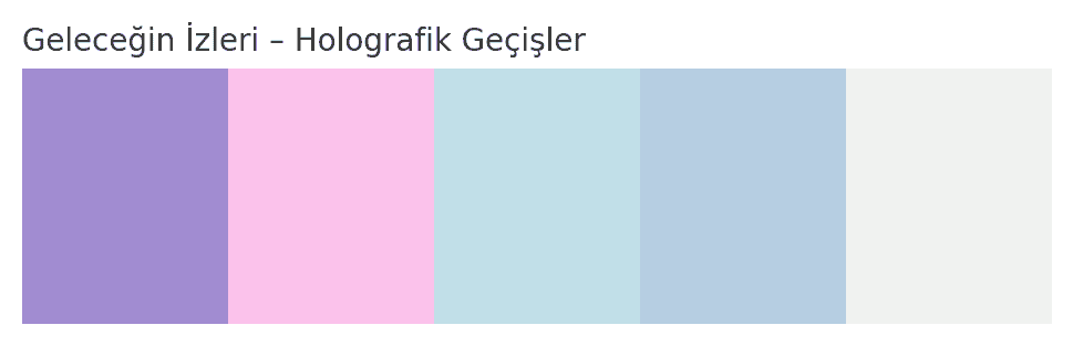
Traces of the Future: Holographic Color Transitions
Another palette intertwined with technology involves holographic and metallic color transitions, synonymous with concepts like artificial intelligence, the metaverse, and augmented reality. Purple, blue, and silver typically dominate these palettes. Technology brands especially aim to create an innovative and forward-thinking identity by using these tones.
Such colors make a difference not just visually, but experientially too. A holographic detail encountered by the user transforms the design from merely "viewed" to a "felt" element. This effect becomes even more pronounced in interactive web designs, digital art exhibitions, and NFT platforms.
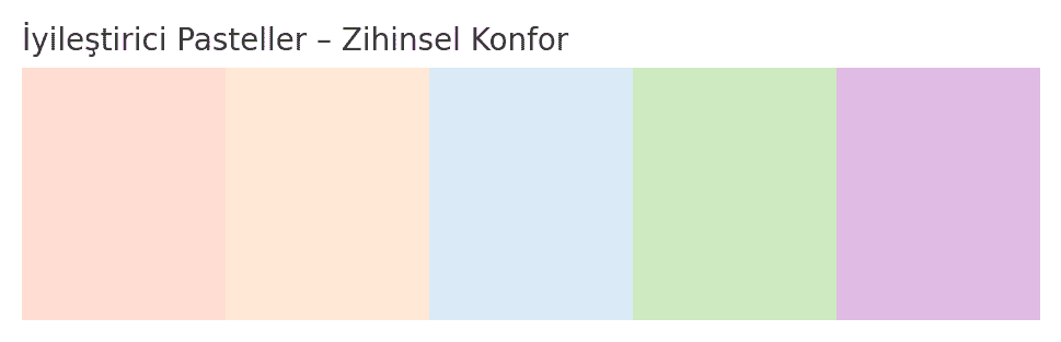
Healing Pastels: Colors of Mental Comfort
The "return to self" movement, which began after the pandemic, continues its influence into 2025. Reflecting this era, pastel tones emerge as a response to the need for mental relaxation and simplification. Light pinks, sage green, and dusty blue, for example, take on a "healing" role in both physical and digital environments.
The strongest aspect of pastel colors is their adaptability to almost any sector. They create a comforting style in the fashion world while establishing a user-friendly atmosphere in mobile applications. With a wide range of uses from educational technologies to healthcare, these colors encourage users to engage for longer periods.
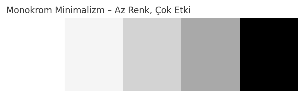
Monochrome Minimalism: Few Colors, Big Impact
Another notable direction in color trends is the "less is more" approach. Monochrome palettes, using foundational colors like black, white, and beige either alone or with minimal transitions, offer an aesthetic particularly favored by premium brands. These palettes emphasize the power of simplicity. Frequently seen on luxury brand websites, in architectural visuals, or fashion campaigns, this style conveys a sophisticated and confident message to the viewer. The scarcity of color allows content or products to stand out more prominently.
Applying Color Trends
Beyond understanding 2025's color trends, another equally important aspect is using these colors in the right context. Here are a few key recommendations to keep in mind when applying this year's colors in your designs: Choose by understanding color psychology. Determine colors according to the emotions you want your target audience to feel. Use tones compatible with your brand identity. Not every trendy color may be suitable for your brand. Do not neglect contrast and accessibility tests in digital projects. Even if colors are beautiful, readability is always a priority. Integrate your chosen palette with all design elements: it should be in harmony with typography, icons, backgrounds, and animations. Result: In 2025, Colors Are Perceived Not Just with the Eyes, But with the Heart 2025 design colors not only offer us aesthetic choices; they also reflect the changes society, technology, and the individual are undergoing. Every tone points to an emotion, an era, or a vision. Seeing colors not just as “good-looking” elements, but also as “storytelling” tools, will make this year more meaningful from a design perspective. If you also want to successfully reflect these trends in your projects, don't just choose a color. Also know what your chosen color tells, how it makes one feel, and in what context it will be used most correctly. Because in 2025, good design speaks with its color.
Latest Blogs
Stay up-to-date with the fast-changing dynamics of the digital world, the latest trends and industry developments. Explore other blog posts from our expert team, packed with in-depth analysis and practical tips that add value to your business.

Get a Quote Now and GO with Granobra!
Aiming to rise digitally and claim your place at the top?
You’re in the right place to uncover your brand’s true potential with Granobra’s expertise.
Get your free quote now and let’s say Go! to digital success together.